Tower House
Andrew Maynard Architects
Victoria, Australia
Architect: Andrew Maynard Architects
Directors: Mark Austin and Andrew Maynard
Design Architect: Andrew Maynard
Project Architect: Mark Austin
Completion date: March 2014
Builder: Overend Constructions
Engineer: Maurice Farrugia and Associates
Garden and Landscape
Garden design: Bush Projects and Andrew Maynard Architects
Plant selection: Bush Projects
Landscape contractor: Lucida Landscapes
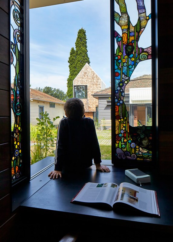
Stained Glass: Leigh Schellekens
S+P and their 8 year old twin sons asked for a home “for community, art and nature to come together”. We designed them a village.
What?
Tower House is a renovation and extension to a weatherboard home in Alphington, Victoria, Australia. We restored the original, where we have two kids’ rooms, a bathroom and living spaces. A studio, bedroom, bathroom, kitchen and dining occupy the new part of the house. Tower House is the result of endless conversations with a trusting, enthusiastic, patient and encouraging client.
Who?
Mum, dad and twin boys live at Tower House. The family have keen interests in the environment, outdoor recreation and the arts. We first met to discuss Tower House just days before a federal election. Fear that in two days we would have a new, particularly nasty, negative and destructive Prime Minister loomed heavily in the air. Our discussion on that first day was not about kitchens and bathrooms. Our discussions were about life, art, politics, charity, the universe and everything. We knew we had a great client on that first day. The words S+P used were carefully considered. Nurturing, stimulating, gallery, inspiring, delightful, both social and private, introverted and extroverted, legacy, responsibility, character, engaging, discourse and community. In their home S+P wanted the story to be about more than them. S+P wanted the story to include us. All of us.
Context?
Tower House is near parkland and the Yarra River, with views to the Amcor chimney stacks. Tower House is bound by two roads. One is a leafy post-war suburban street. The other, which faces onto backyards, feels like a country road. With the exception of a few new homes the context is small, humble weatherboard and brick abodes. A chunk of large contemporary architecture would be an imposition in this context.
Why?
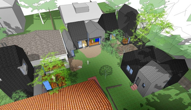
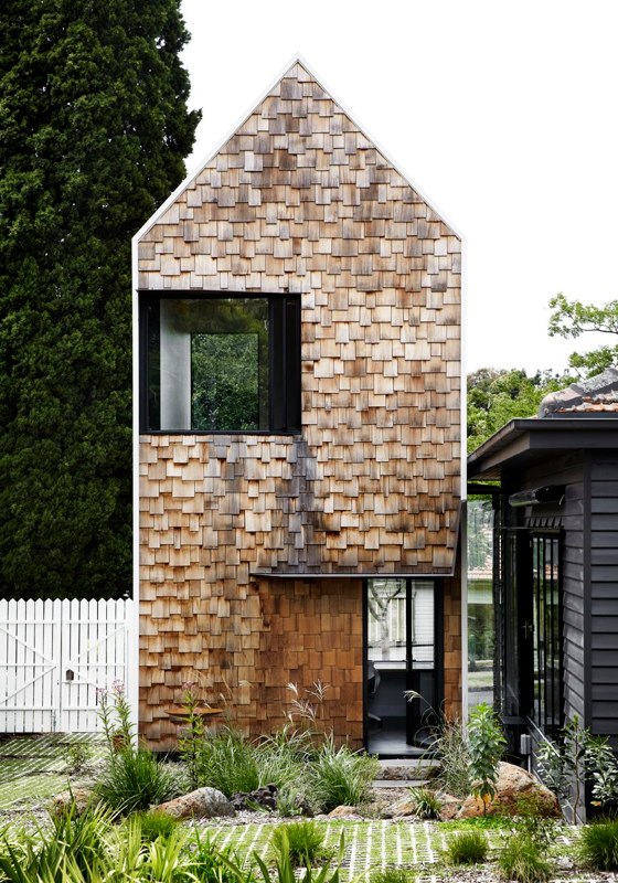
Tower House is the result of a vast number of concurrent discussions about issues far broader than the home itself. Though the brief was not small, our proposition was to create a series of small structures of a scale and texture that did not dominate its context. Tower House is about a lot of things. Here are our highlights:
The twins’ sketches
During an early design meeting we handed the twin boys paper and pencils and asked them to quietly entertain themselves while the adults spoke about ‘more important things’. After discussing the complexity of designing a home, and the various possibilities, we had all found ourselves deep down the rabbit hole, confused, lost and tired. We looked over to the boys to discover that they were not drawing cars, soldiers or dragons. Instead they had drawn their house. With modest confidence they slid their simple sketches, complete with notations, to me saying in unison “there you go”. Their sketches distilled a lot of ideas. They had firmly pushed the boat off the shore and we were on our way.
Home as village
As homes increase in size they increasingly appear as hostile monoliths. When a home is extended, often the monolith crashes into the original. The later looking like an alien cancerous growth on the former. Tower House is anti-monolith. Tower House is village externally and a home internally. The house defies logic as the exterior appears to be a series of small structures, while internally the spaces and functions are large and connected. Like the Tardis, it’s small on the outside and large internally.
Missing No.5
The mysterious case of the missing No.5. There is no No.5 in this street, which is odd. No.3 and No.7 sit side by side and no one can explain why No.5 was omitted. Tower House finds a small gap between 3 and 7 to build a new structure. It’s not No.5. The new tower fills the numerical gap. But the mystery remains.
5th elevation
When designing the Sydney Opera House Utzon spoke of the fifth facade, knowing that the roof will be the part of the building that dominates the view from the Harbour Bridge and the tall buildings nearby. The street front is no longer the public face of our buildings. Google Earth has made the roof the public face of our buildings, accessible to anyone at anytime. We can now easily see all of the mess that has been hidden on the rooftop. What was once hidden is now fully displayed. With this in mind we deliberately designed Tower House so that it looked beautiful from the sky and from Google Earth.
It’s all about community.
Increasingly our houses are overly concerned with privacy. Fences are getting higher and we are turning our backs to our neighbours. It’s starting to look less like house and garden and more like compound and security. What’s happening to neighbourhood and community? Tower House can be both. The front yard is now a communal vegetable patch. Neighbours are invited to help themselves and, if they wish, do a little gardening. The rest of the garden has a high fence around it, however you can see through the fence and, importantly the fences can be left open wide. With streets on both sides of Tower House neighbours can use the garden as a short cut and grab a few veggies on the way through. With the gates wide open the line between public and private starts to get blurred.
The Net
Australia is wide and flat. As a result our homes are wide and flat. Our HOUSE House project explored the idea of creating a vertical home, in contrast to the typical Australian home. The boys studio pushes this idea further. It is a wholly vertical space with a bookshelf running from floor to ceiling. The boys desks are at the base of the studio, where they can studiously work. Hanging within this tall space is a net where the boys can read, and contemplate with a view to the street and a view to the backyard. The boys study is designed to inspire the boys as they grow and learn.
Her library.
S’ library is a place of thought and contemplation. Slightly submerged, the desk is almost buried in the garden. Lined with dark spotted gum the library has an age and a wisdom that is in contrast to the playful contemplation of the boys study.
His spot.
P has a sneaky spot in the roof space above the kitchen. Lined in synthetic grass with nothing more than a banana lounge and a book P’s spot it a hideaway within the centre of the house.
Cha-cha-cha-changes
Tower House is a long-term family home. The boys will be adults when (if) they leave. The house can easily adapt from being a shared family home to being two separate zones with distinct entries. Within the original house we have hidden sliding panels which allow the large shared rooms to be divided into small. A variety of different activities can take place, whether shared or private. It’s the best of both worlds.
Sustainable?
Like all of our buildings, sustainability is at the core of Tower House. Rather than simply extruding the existing structure we have run the new form along the southern boundary so that it is soaked with sunlight. The openings and windows have been designed to optimise passive solar gain, thereby drastically reducing demands on mechanical heating and cooling. All windows are double glazed. White roofs drastically reduce urban heat sink and heat transfer internally. Need for air-conditioning is eliminated through active management of shade, and flow through ventilation. Water tanks have their place as they do on all of our projects. High performance insulation is everywhere, even in the walls of the original house.
Photos: Peter Bennetts and Tess Kelly


No hay comentarios:
Publicar un comentario
Para poder comentar es necesario que cuentes con una cuenta Google, ya que esto implica que de antemano has aceptado la gestión de tus datos personales por parte de Google LLC, propietario de Blogger. En este caso, el envío del comentario es una aceptación explícita e inequívoca de la gestión tanto de tus datos como del comentario mismo para uso de AIB Architecture. La finalidad de la recogida de los datos, además de permitir mostrar tu comentario, es para poder responderte por este medio. Consulta más información en Aviso Legal y Política de Privacidad.